Org Chart: from forgotten feature to the #1 engagement driver in Career Hub
Redesigned for discoverability, context, and usage — turning a buried utility into the most-visited feature for new and existing employees.
Download full PDF case study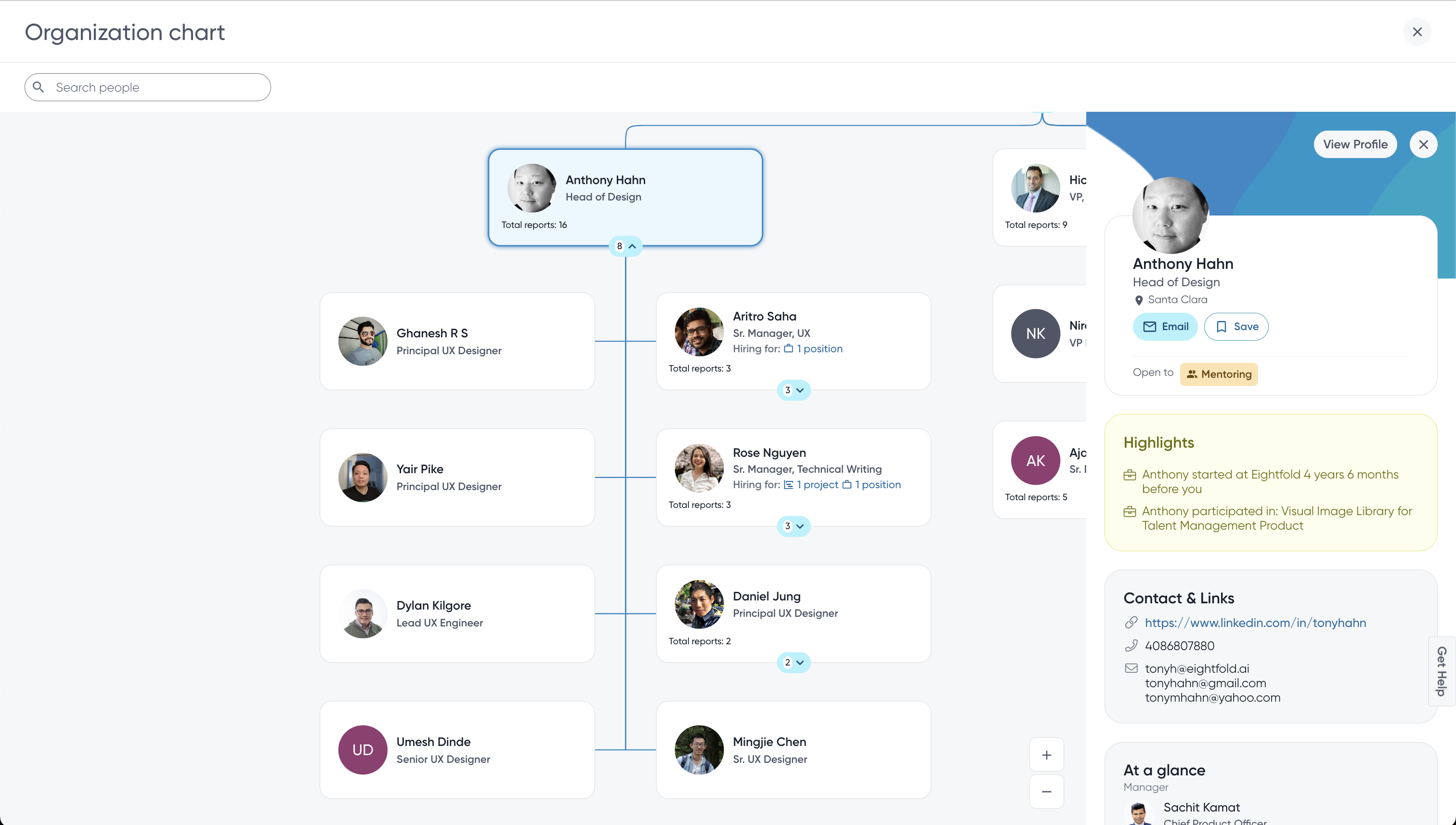
Wearing many hats as the solo designer
As Principal Designer, my role went beyond screens — I helped shape how people connect and get visibility across the org. I owned strategy through spec, working closely with PMs, engineers, and researchers to make sure this wasn't just a UI fix, but a long-term, scalable shift in how the org chart delivered value. I also mentored a junior designer and drove cross-team adoption of the patterns we built.
Eightfold AI · Career Hub
Eightfold AI is an AI-powered Talent Intelligence Platform used by global enterprises to hire smarter, retain talent, and drive internal mobility. Career Hub is its internal, employee-facing product — helping people explore internal jobs, discover teams, connect with mentors, and grow their careers.
A high-impact opportunity, hiding in plain sight
Our broader goal was to improve engagement and adoption of Career Hub. User feedback pointed to one insight: employees lacked visibility into the org — who's on their team, who's hiring, and how they fit in. Org Chart already existed, but it was buried and underused, at under 5% monthly usage. That made it a high-impact opportunity: turn an underperforming feature into a central hub for team and role discovery.
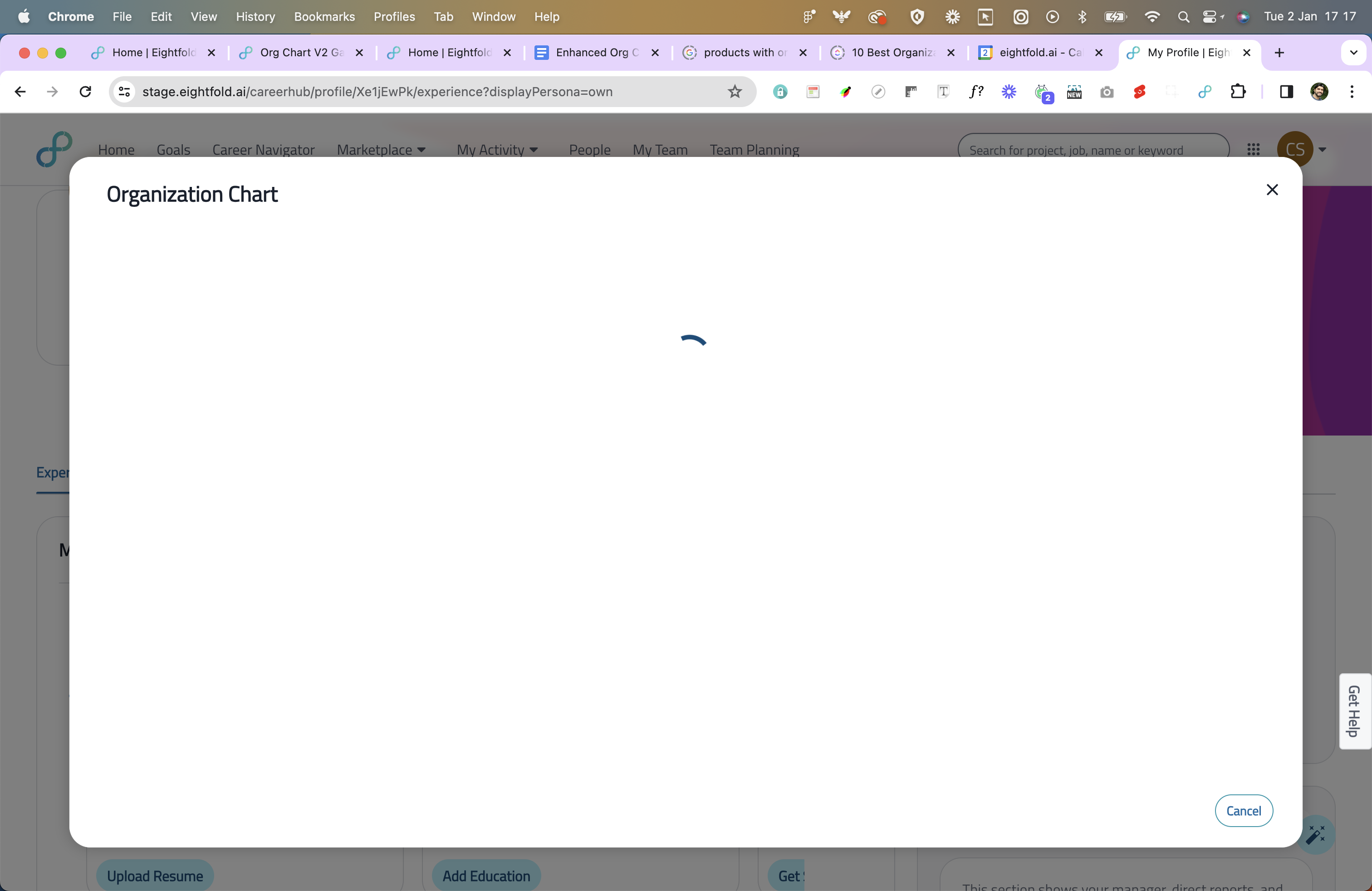
A popup interruption became a full-screen destination
When Org Chart launches, giving it room to breathe enabled deeper navigation and context without interruption — and avoided accidental dismissals.
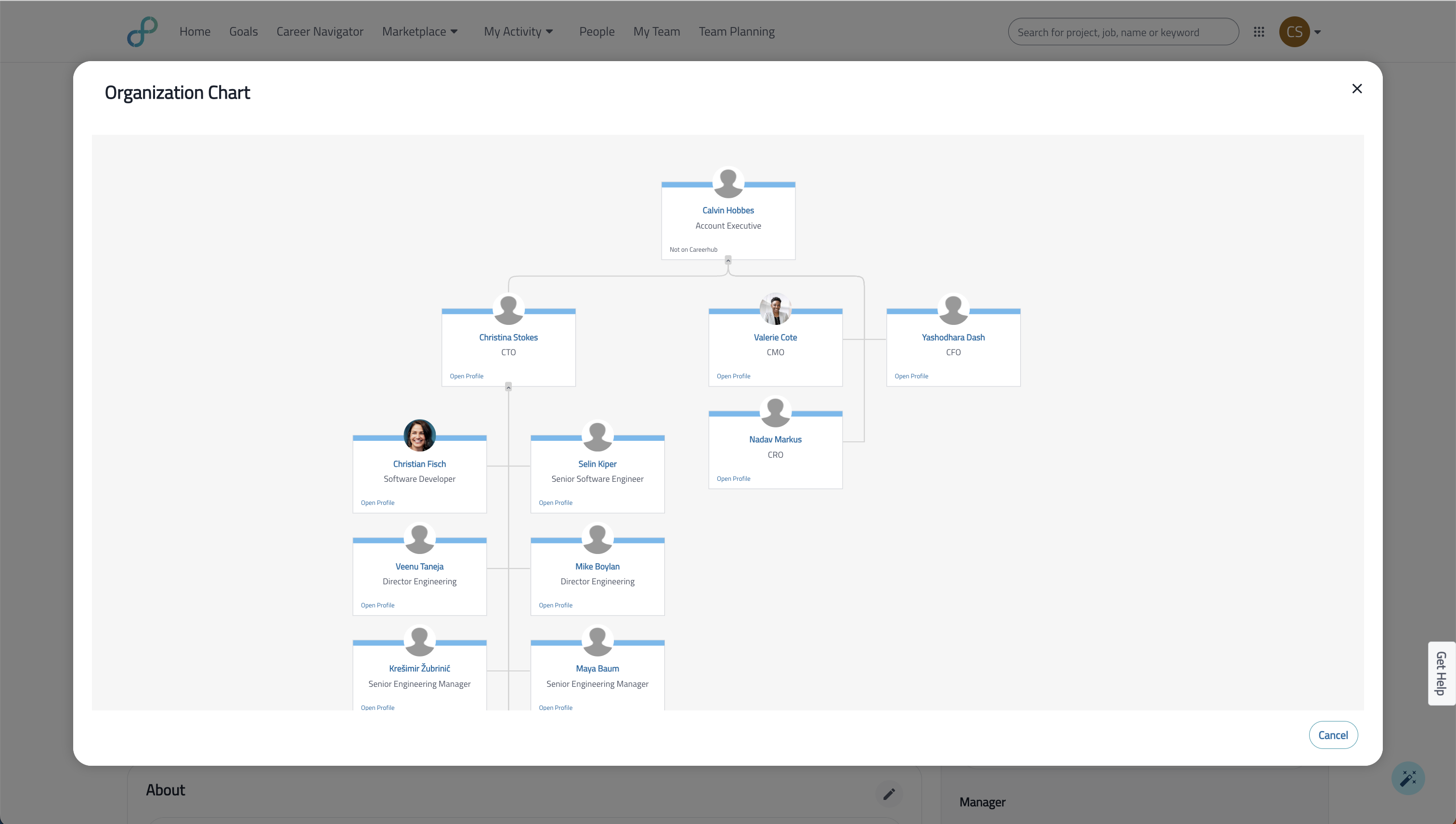
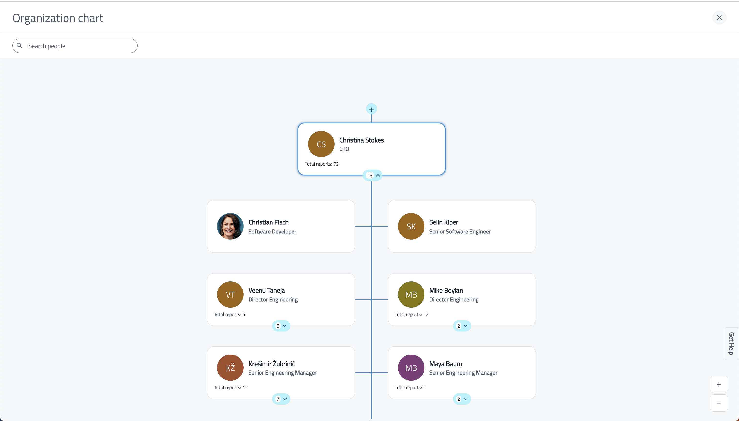
A click used to reload the whole chart. Now it opens a mini profile.
Card highlight + quick preview improved discoverability by 23% and let people take action without opening the full profile.
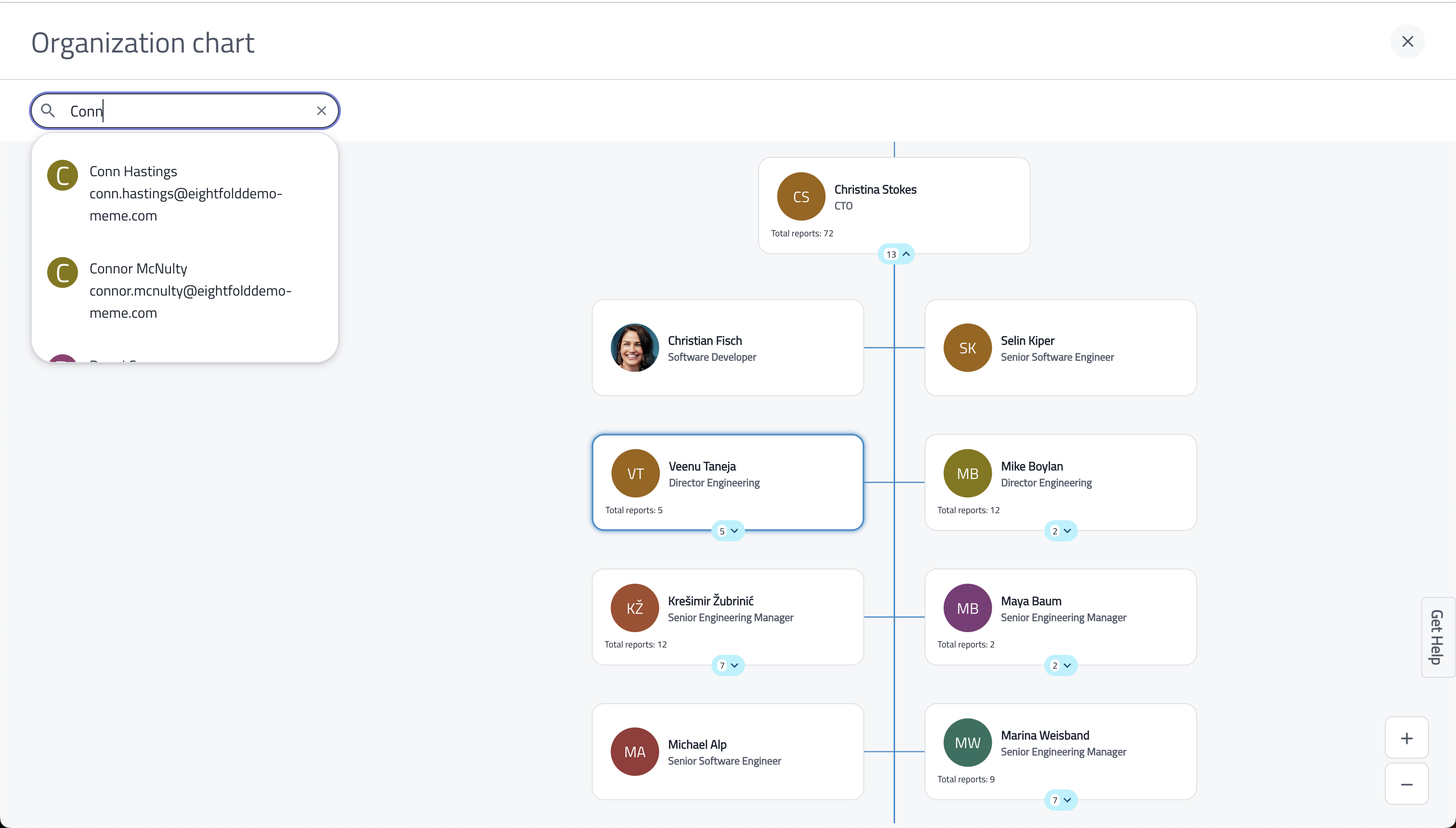
This also introduced persistent navigation (seamless switching between profile and org chart), zoom controls for orientation in complex structures, and team size / hiring info so leaders could assess span and hierarchy at a glance.
Turning a hidden utility into a daily habit
We reframed the work around three aligned goals — business, product, and UX.
Two buckets, different needs
Making smart tradeoffs at scale
This wasn't just a design clean-up — it was system-level negotiation: performance tradeoffs on orgs with 1,000+ employees, competing needs across ICs / managers / HR, a rigid design system, and tight dev bandwidth.
Inline search cut 4+ clicks per task
Global search inside the chart reduced scroll fatigue and enabled fast lookup and jump-to-peer — without leaving the view.
Designing for the gaps
Covered: no supervisor, no peers or reportees, custom text overflow, and users not yet on Career Hub — avoiding dead ends by surfacing them in search suggestions instead.
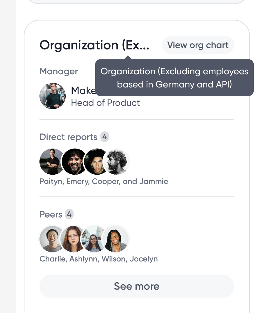
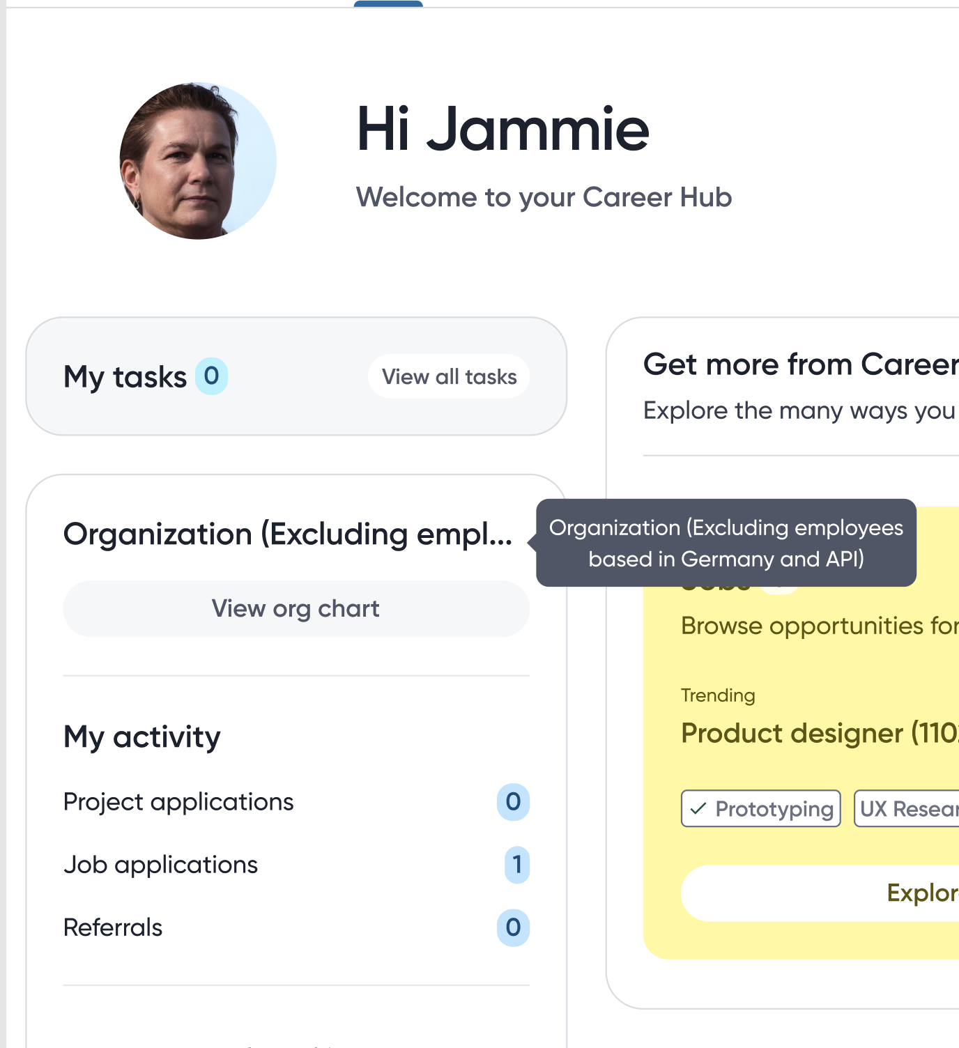
From hidden feature to #1 in Career Hub
Tracked via internal dashboards (Mixpanel), in-app events, clickstream data, and daily active usage logs.
Not just a redesign — a rethink of how people connect with people.
This project took a forgotten corner of the product from utility to discovery tool, proved the power of scalable design systems (the patterns were reused across two more tools), and was driven end-to-end solo — strategy, execution, and impact.