← All work
ThoughtSpot · Data Portal
Data Portal revamp: a workspace that finally matched how analysts think
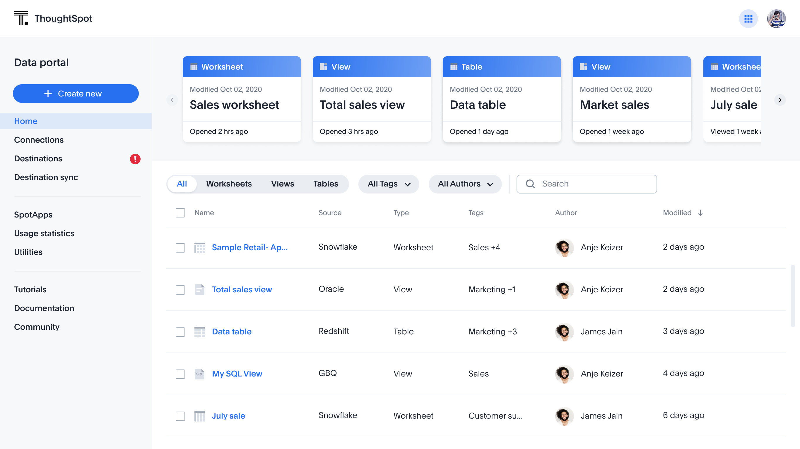
Rebuilt the home for connections, worksheets, and views — replacing an inconsistent, overflow-menu-heavy layout with a structured, scalable workspace.
Role
Lead designer, solely responsible
Stakeholders
Product & Engineering leads
Outcome
Consistent, scalable UX
Problem
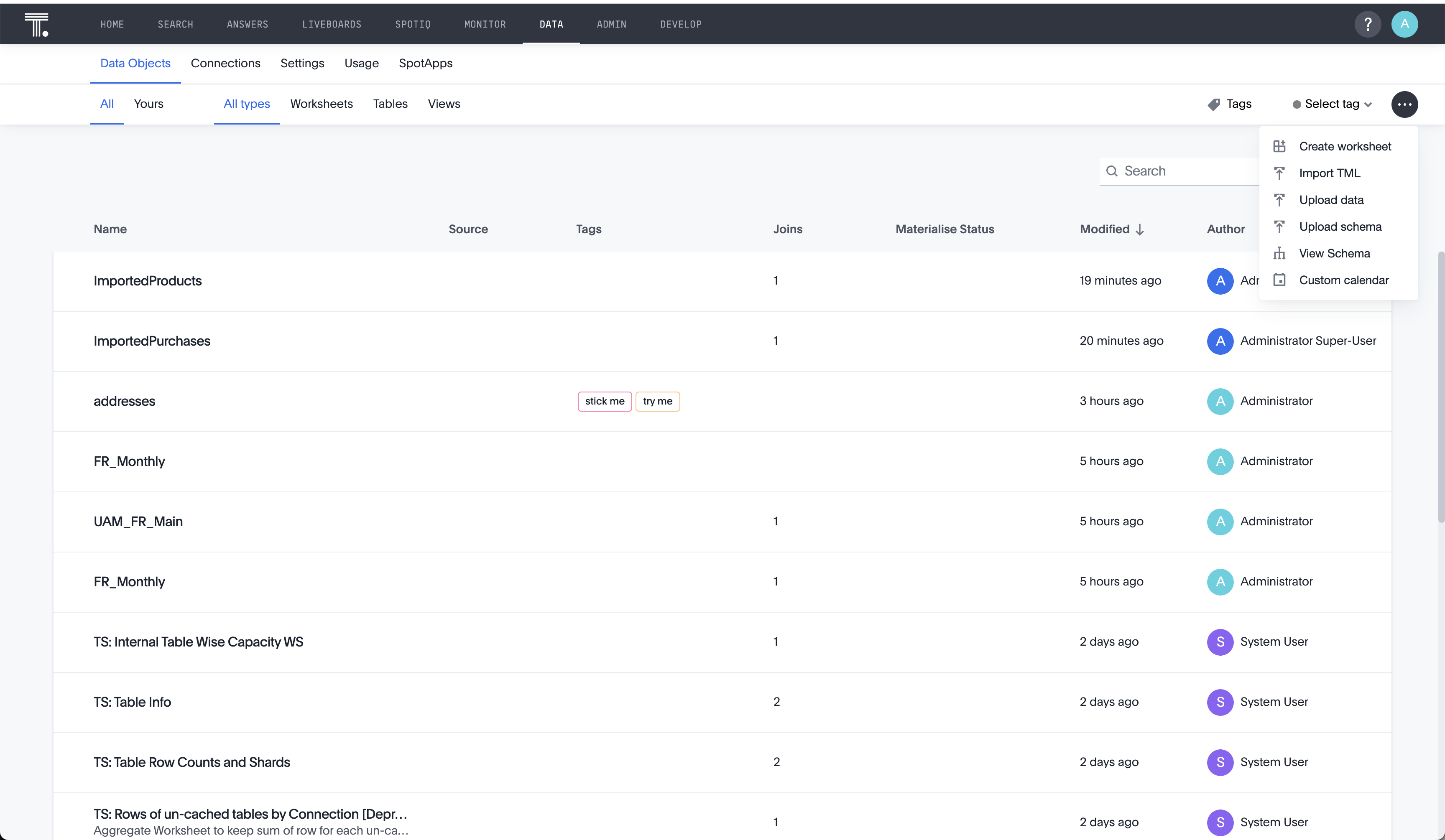
Everything was hidden under one overflow menu
The old Data Portal experience needed a revamp to address a lack of discoverability — nearly everything lived under one overflow menu — a lack of scalability for future object types, and inconsistency with recent updates to other pages like Admin and Dev, which had already moved to a newer visual approach.
{{ t }}
User persona
Designing for the data analyst / engineer
The primary user of the data workspace is the data engineer who models data and sets up configurations so business users can consume insights.
Attitude
Wants to be kept informed.
Needs
Easy access to frequent tasks; flexibility and efficiency in getting things done.
Challenges
Time pressure, a real learning curve, and data that can feel overwhelming.
Research & UX audit
What the audit and user interviews surfaced
{{ f.title }}
{{ f.body }}
Requirements
Concluded from research and UX audit
Challenges
Constraints and tradeoffs while designing
Key solutions
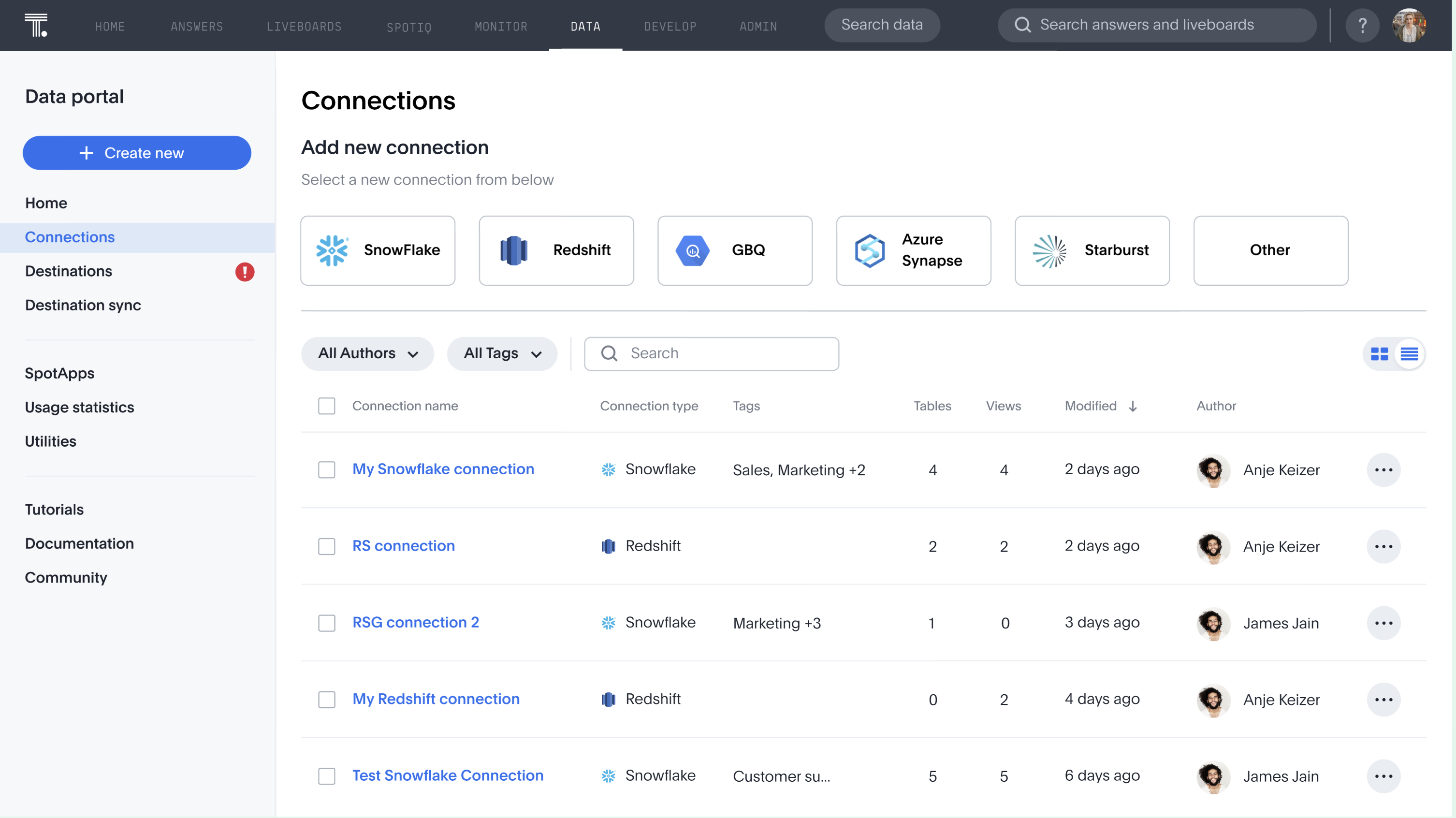
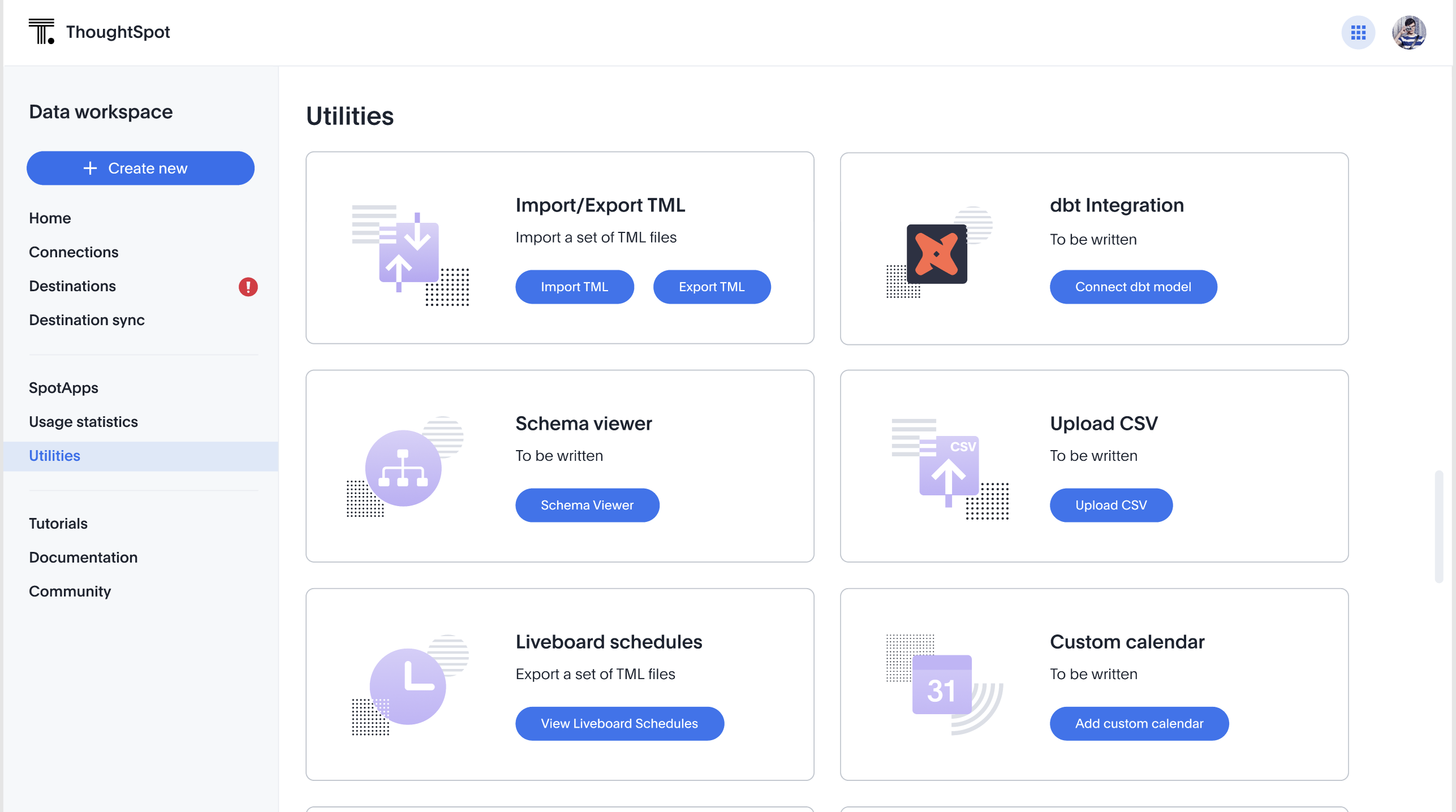
Five surfaces, one consistent structure
Refinements
UX is never done
Feedback from demos and usage kept the work moving after launch.
Card view scalability
After demos, we learned production environments have far more connections than expected — so we added a view switcher.
Too much scroll
Feedback showed the Utilities pages needed too much scrolling to find functionality — so we restructured it.
Also on the list: accessibility improvements, small details and micro-interactions, breakpoints and responsiveness, and standardizing components and widgets.
Improvements & growth
Product
Easier single-user adoption via the SQL editor, and faster time to value through SpotApps and dbt integration.
Design
Consistency with other product pages, and reusable patterns built to scale beyond this one surface.
Personal growth
Sharper presentation and executive-influencing skills, plus more active planning and pushback on unclear requirements.
Takeaway
A consistent structure that scales past this one release.
Owning this end-to-end — from audit through five distinct surfaces — meant every tradeoff (performance, legacy features, shifting scope) had to be made with the whole system in mind, not just the screen in front of me.